I used an Antique game box cover on the cover of the journal. Also I glued on some "F-U-N letter stencils that I inked and aged with crackle paste.
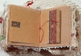
There are lots of pockets and tuck spots.
Most everything is antique or vintage - except for some scrapbook papers, and journaling pages.
Tooooo Punny!!
A journal needs places to journal on.
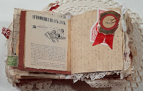
I found some books with images of old games and puzzles.
Antique book pages with playful images were fun to use.
Grungy collages on pages.
A game spinner!!
The journal measures 6.25 inches by 5.25 inches and is 2.5 inches thick. It has a soft spine so it opens up wide. 172 pages, of different sizes quarter, half and full pages. 129 pages to journal on.
I think I forgot to mention there are coffee dyed papers in this book so it is not acid free. Not a good place to keep precious photos...in case you were wondering. 🤔 But a supper fun place to journal in!
Find it for sale HERE
Thank you so much for stopping by to look!!!


This is one of the top 5 best journals I’ve ever seen, and trust me when I say that I’ve scoured Pinterest for many years looking just at diy journals. I absolutely love the way you’ve incorporated both a theme and color (my favorite - red) without going too overboard with either. You are a creative inspiration!!!
ReplyDeleteI absolutely love this!! You utilized a theme and a color (red - my favorite add to anything sepia or b&w) without going overboard with either. You are a creative inspiration and a new muse of mine. Thank you so much for sharing this beautiful work of art.
ReplyDeleteI absolutely love this! You utilized one theme and one color - red happens to be my favorite to pair with anything predominantly sepia or b&w - without going overboard on either. I love the way you used variation on your theme as well as occasional and random deviation from it. You are a creative inspiration as well as my newest muse. What an outstanding piece!
ReplyDeleteI absolutely love this! You utilized one theme and one color - red happens to be my favorite to pair with anything predominantly sepia or b&w - without going overboard on either. I love the way you used variation on your theme as well as occasional and random deviation from it. You are a creative inspiration as well as my newest muse. What an outstanding piece!
ReplyDeleteThank you so much for such a thoughtful and lovely comment Jess! I'm so glad you like it!!
Delete~Terry